How to Choose the Best Color Combinations for Your Website
How important do you think color is to a website? Not that important, right?
Wrong.
85% of shoppers base their purchasing decisions on color alone. Using color to your advantage does a lot more than look pretty on a computer screen.
It helps increase sales and brand recognition while influencing customers’ emotions and impulse buys. Think about it: you’ll get more business all because you utilized color on your site!
Curious to know how to pick the best color combinations? Keeping reading for effective tips!
Understand Color Psychology
Don’t worry, you don’t need to take a college course on color psychology. Instead, take a moment to familiarize yourself with which colors evoke the right emotions for shoppers.
Yellow
Yellow is associated with joy and grabs attention. It’s mostly used to attract window shoppers.
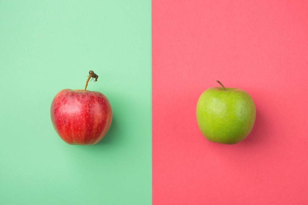
Red
Geared towards impulse shoppers, red represents energy and strength. However, be mindful when using this color. It can also signal danger and raise blood pressure.
Blue
If you’re stumped as to what color to use, blue is a safe choice. It’s associated with authenticity and peacefulness.
Get Color Inspiration from an Image
Instead of creating your palette from scratch, turn to images for help. This could be stock images, your own photography or graphic designs.
When you go about creating a color scheme inspired by photos, you end up with a more unified website design. It creates contrast between every element, making your site look cohesive.
You can use Pinterest for already-made color palettes derived from images.
Use the Color Wheel
Can’t narrow down your color selection? Turn to the color wheel!
Use it to choose either analogous or complementary colors. Analogous colors are colors that are right next to each other on the wheel. Complementary is the opposite, where colors sit across from each other on the wheel.
Complementary colors include:
- Yellow and purple
- Green and orange
- Purple and green
Analogous colors include:
- Orange and red
- Green and blue
- Yellow and green
When in doubt, use the color wheel to get you started with a palette.
Keep It Simple
It’s easy to get carried away when choosing a color palette. You want to add all the colors of the rainbow as not to alienate customers. However, this quickly outdates your site and overwhelms users.
Instead, follow the 60-30-10 rule. You need three colors, one primary, one secondary, and one accent color.
From there, you’ll use 60% of the primary color, 30% of the secondary color, and 10% of the accent color. Using only three colors seems minimal but it helps create harmony through your entire design.
The Best Color Combinations for the Taking
There’s a lot to consider when choosing the best color combinations for your business’ website. Whichever you choose, make sure to use them wisely and based off of what your customers will react best to.
Does your website need a complete overhaul? Check out our web design and development services today!