Follow the Leaders: The Importance of Visual Hierarchy in Web Design
Did you know the average visitor will only spend 2.6 seconds scanning your website?
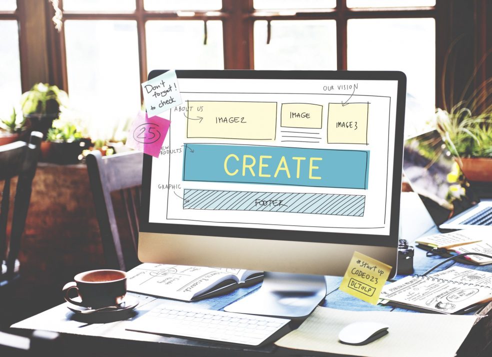
If you want to reduce your site’s bounce rate and improve its conversion rate, you must utilize visual hierarchy. It’s not enough to make a site that just “looks” nice—it should lead visitors on a specific path.
Professional web designers know how to do this, but it’s also good for you to understand the basics. In this post, we’ll provide a quick overview of visual hierarchy and how you can use it for your website.
Read on to learn more!
Know the Scan Patterns
Before we discuss specific design elements, let’s examine the two main ways readers scan a webpage.
The first is an “F” or “E” pattern. Most users start on the left side of the page, scanning for a headline or keyword that captures their interest. Then they’ll begin reading horizontally along that line.
A variation of this is the “Z” pattern, where the user scans the top line, moves to the bottom left corner, and begins scanning again. Knowing these main scan patterns can help you decide where to place the most important elements of your site.
Understand Visual Hierarchy Elements
Here’s a brief overview of the 4 main design elements in content hierarchy.
1. Size
People’s eyes are naturally drawn to larger objects, so you’ll want to increase the size of your major site components. This usually includes the headlines and call-to-action buttons.
Correlate size with importance, making your most important elements the biggest. Of course, don’t overdo it either—strive for balance and harmony while making your main points stand out.
2. Color
Bold colors like red and black demand attention. Softer colors, like cream or pastel shades, usually take a backseat. Don’t overlook the emotional response that different colors create, too.
Create a powerful visual punch by using contrasting colors (like blue and orange) to draw your reader’s eye. Combine standout colors with increased size to capture the attention of your visitors.
3. Texture & Style
The style and weight of your fonts are as important as where you place them. Texture adds atmosphere and depth while enhancing the aesthetic appeal.
There are no hard and fast rules about using textures, icons, or other graphic elements. Textured backgrounds, however, will always make anything in the foreground stand out more.
4. White Space
To balance and round out your visual elements, you also need the right amount of white space. Rather than thinking of white space as an empty canvas that must be filled, use it as another design tool.
The fewer elements you have, the more powerful the existing ones become. Having the right amount of “empty” space between each important component will keep them where they should be—the center of attention.
Need Help With Your Site Design?
Once you understand visual hierarchy, you’ll be able to create a website that leads visitors exactly where you want them.
Eye scan patterns help you decide where to place the main elements of your site design. Use size, color, and texture to make those main features stand out.
Finally, the right amount of white space will result in a balanced, attractive website. By combining these visual hierarchy elements, you should see a nice boost in your conversion rates!
Did you find this article helpful? What else can we help you with?
Contact us today with any questions or concerns about your website.